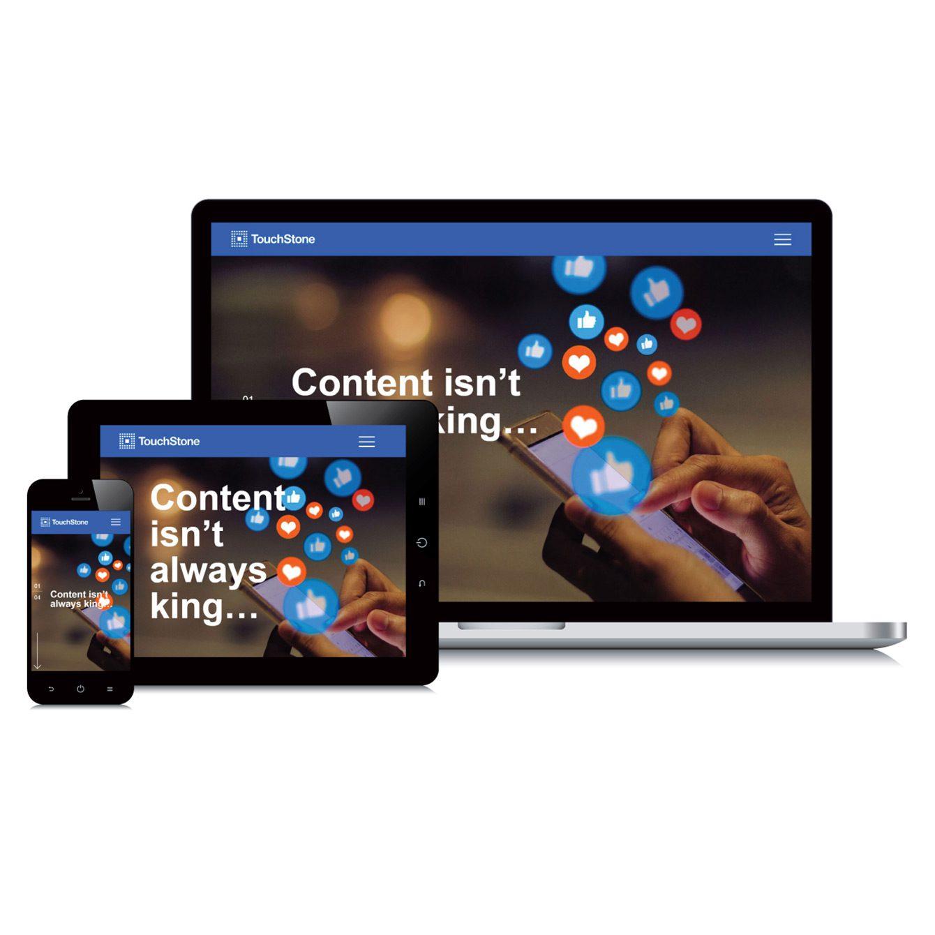

Statistically, more people prefer handheld devices to desktop computers, so most web browsing takes place on a phone or tablet. That’s why it’s essential to have a mobile responsive website.
What Does Mobile Responsive Mean?
A mobile responsive site can load on a mobile device. It automatically adjusts to the size of the searcher’s phone or tablet. Responsiveness ranges from rearranging and resizing web elements to completely reconfiguring a website to suit the specific mobile device.
What’s the Difference Between Mobile and Responsive Websites?
Before mobile responsive websites, mobile traffic was routed to a different subdomain to accommodate the search device. For example, if your website’s domain was ACME.com, your mobile website domain could be M.ACME.com. The subdomain would have been designed for a completely different user experience.
However, there are problems associated with using a mobile-specific subdomain:
- It creates a confusing user experience. Users may mistake the mobile URL for the main website URL, which will affect your website’s search engine optimization (SEO) value.
- Google will view your subdomain as a separate website, decreasing overall visits to your main website.
- Google penalizes websites that are not mobile responsive.
Testing for Mobile Responsiveness
Making a website mobile responsive is a good place to start, but it’s only a piece of the puzzle. After all, what good is an attractive mobile website if it takes too long to load?
Designing a website that loads quickly on a mobile network is no small feat. It requires formatting images and asset files to load efficiently on mobile devices. Resizing content, refactoring page animations, and resizing links and buttons to a clickable size will boost your website’s load time.
There are resources that allow you to test your website’s mobile responsiveness and load time for free. Google offers a tool that will give you insight into your website’s current performance and provide suggestions for improvements.
It’s also important to consult your web developers before reformatting your site. Ideally, they will know how to develop mobile responsive websites.
Know When to Start Fresh
If your website has languished without responsiveness updates, it may be easier to build a new site from scratch. Most images and content can be repurposed, but if the desktop version of your website is outdated, it’s usually best to start over with a more modern codebase and strategy for SEO purposes. That’s not always the case, so be sure to talk with your web developer for recommendations.
If your website is not mobile responsive, you may miss out on the SEO advantages of the modern web. Engaged users who understand your website interface are more likely to convert into customers and increase your web-driven sales.
How to Get Started
Navigate through your website on a mobile device. Evaluate the ease with which you browse your site and consider the overall user experience.
Here are some questions to consider:
- Is my website easy to navigate? For example, is the menu bar formatted so it can be found quickly on a mobile device?
- How long does it take page elements to load on a mobile device?
- Are the images and content rendering correctly for mobile, or are they skewed?
- Is there any content that’s cut off or showing errors?
The web developers at TouchStone Digital have a strong track record of optimizing websites for mobile responsiveness. Call 419-299-9000 or contact us online to find out how we can help.
Share article